Fujifilm Recipes: Understanding the Settings and Perfecting Your Own
Fujifilm film simulation and recipes have become a popular tool for Fujifilm photographers seeking to experiment with various photographic looks. Getting started with film recipes can be confusing. There are multiple settings, some straightforward and others not. At first, it may not matter. You find a recipe online, enter the settings into your Fujifilm camera, and start taking photos. Hopefully, they are everything you thought they would be. However, this is not always the case. Some recipes work better than others for your photography, and many are effective only in specific shooting conditions. Consistent experimentation is key to understanding what works and what does not work for you.
As you become more familiar with film recipes, your research will yield endless possibilities. Truthfully, there are too many to try every one of them, and some can look similar. As a result, you may want to create your own look and understanding what each setting does is essential to creating a film recipe that works for you. After all, you are the only one who knows what you like to shoot, when, and how.
If you are starting with film recipes or experimenting with creating your own, this post will explain each setting and how it influences your look. Some settings are relatively subtle, others are quite significant to your results.

Peggy’s Cove - Soft Vintage Glow Recipe
Film Simulation
Film simulation replicates the look of various classic film with distinct looks from each choice. They can be used as is, as many photographers do, or you can consider them as the foundation of your recipe. This is the base on which you will build. It’s an important one, too, as it is one of the most significant factors in shaping the look of your final recipe. I find that most recipes start with only a few of these simulations, as some are more versatile than others. Classic Chrome and Classic Negative seem to be the most popular.
Depending on the age of your Fujifilm camera, your choices will vary. Some have been added via firmware upgrades. I have a Fujifilm X-H2, which I have enjoyed for a few years now. As a result, we’ll use it as the example in question.
Provia Standard - balanced colour and contrast
Velvia Vivid - saturated colours with pronounced contrast
Astia Soft - vibrant, yet softer colours and contrast
Classic Chrome - muted tones with deeper shadows
Reala Ace: natural colour reproduction, balanced contrast
Pro Neg. - increased contrast and more saturated colours than Pro Neg. Std
Pro Neg. Std - softer contrast and more uniform tonal transitions
Classic Neg - emulates classic colour negative films, moderate saturation and soft contrast.
Nostalgic Neg - saturated and soft gradation
Eterna Cinematic - subdued colours and noticeably low contrast
Eterna Bleach Bypass - simulates a bleach bypass process, which provides an overall lower saturation and muted colour with increased contrast
Acros: black-and-white simulation with overall higher contrast than Monochrome
Monochrome - black-and-white film simulation that produces softer images with less contrast than Acros
Sepia - toned monochrome look
Negative: Bold colours, soft tones, and medium contrast
Grain Effect
This will add grain to your JPEGs, if preferred. First, there is Roughness (Weak, Strong), and then there is Size (Large, Small). With the settings on both, you can adjust the grain intensity and size. I rarely use a strong or large setting. It’s only my personal preference. I like some grain, but I find large or strong too much for my liking.
Colour Chrome Effect
Fujifilm’s Colour Chrome effect enhances photos by deepening and darkening vibrant colours, especially in highly saturated areas. Most importantly, it doesn’t oversaturate your images. This works well with colourful subjects, especially in warmer colours. It elevates the colours without taking them into an unrealistic state, which oversaturation can cause. This setting has Weak and Strong settings.
Colour Chrome FX Blue
Colour Chrome FX Blue affects the blue tones in an image, making blues appear deeper, darker, and more pronounced without affecting other colours. If you want your sky to be a predominant feature in your image with features and darker shades, this is the setting you will want to experiment with. Think of it a bit like a polarizing filter. When employing Colour Chrome FX Blue, there are two settings: Weak and Strong. The effects can be very noticeable in your final image.
White Balance and Shifting White Balance
Many of the available white balance choices I never touch, and based on what I photograph, which is mostly outdoors, it’s rare that I have used a film recipe with anything other than Auto or Daylight white balance as a starting point. However, in addition to the standard white balance setting, you can also adjust the reds and blues to tailor it to your preferences. For example, if you favour warmer images, you can drop the blues and increase the reds in the available grid. Adjusting white balance is one of the most flexible settings, and it can significantly impact the final result.
Dynamic Range
I’ve covered dynamic range before, and you can find it here. Understanding and utilizing dynamic range (DR) settings, including Auto, DR100%, DR200%, and DR400%, can significantly enhance image quality in challenging lighting conditions by preserving both highlight and shadow details. Higher DR settings work by underexposing the image by one or two stops to protect bright areas, such as skies, from blowing out, while simultaneously brightening shadows to reveal more detail, resulting in richer tonal depth. However, higher DR settings require increased minimum ISO values (e.g., DR200% sets a minimum ISO of 250, while DR400% sets a minimum ISO of around 500).
DR100%: No further dynamic range processing. Deep shadows and bright highlights.
DR200%: The middle ground for protecting highlights and maintaining detail in shadows.
DR400%: The most amount of highlight protection and shadow detail. Expect darker, more detailed skies with distinct shadows and evident detail.
Tone Curve
Tone curve is similar to what you will find in Lightroom or Photoshop, but the setting here allows you to adjust highlights and shadows directly in camera. The stronger the S-curve you create, the greater the contrast in your image will be. Your adjustments for both highlights and shadows will range from -2 to +4.
Colour
The Colour setting on Fujifilm cameras increases the saturation and vibrancy of all colours in your image, whereas Colour Chrome Effect and Colour Chrome FX Blue affect only select colours. This is important to note, as a push with the Colour setting will adjust saturation overall, and pushing too far can cause colours to appear unnatural. However, that’s not necessarily a bad thing depending on your intention.
Sharpness
This setting is self-explanatory, as it adjusts the overall sharpness of your image. Film recipes typically aim to replicate a specific film stock or film look. As a result, sharpness is usually lower as film was never as sharp as modern digital photography. However, film recipes are unique and personal, and you are free to create a look with any level of sharpness.
I’ve always felt that increased sharpness is unnecessary, since the image is still sharp at zero. Most of the recipes I use, including my custom recipe, Soft Vintage Glow, use reduced sharpness. Even at -3 or -4, I have never found the JPEGs produced to be lacking in sharpness.
High ISO NR
As the name suggests, High ISO Noise Reduction reduces noise in images taken at high ISO settings. The higher the ISO (+), the more noise reduction is applied. Anyone with experience using noise-reduction software knows it's tricky. The more noise you want to eliminate, the higher the degree of noise reduction required. And most of the time, this can make your image look terrible. Additionally, reducing noise substantially can soften the image to the point where it appears muddy. The application of noise reduction, especially at high levels, is noticeable.
Personally, I rarely give digital noise in my images a thought. Fujifilm cameras seem to handle noise well. As a result, I keep this setting at zero or reduce it. If there is noise in the image, I usually prefer it for the aesthetic. Under no circumstances would I want the noise reduced. I’d rather go with what’s there rather than try to get rid of it.
Clarity
If there ever was a slider in Lightroom to quickly ruin an image, it’s Clarity. Clarity adjusts midtone contrast, making your image appear sharper with more definition. Clarity can be easily overused, as even a slight bump in Clarity can have a significant impact. However, reducing the Clarity in your settings softens the image and reduces the midtone contrast. Recently, when post-processing RAW images, I have reduced Clarity in Lightroom. As a result, I keep this setting on zero or reduce it significantly. High Clarity doesn’t align with my use of film recipes. I want images that are imperfect yet pleasing, and Clarity does nothing to enhance either.
NOTE: Using Clarity at any value other than zero will delay your camera's capture time. Clarity is applied after capture, not during.
Perfecting Your Own Recipe
With this many settings, the possibilities are essentially endless. There are many ways to create a film recipe, and understanding what each setting does and how it impacts your image is essential to creating a recipe that you are pleased with. As your journey with film recipes continues, you’ll notice that some work, and some don’t. Sometimes that is easy to discern, as the settings may have dramatic effects that are clearly evident. However, if your settings are tweaked just a bit, that may not be as easy. As a result, I recommend shooting RAW+JPEG to have two copies of the image. A RAW image, with nothing by the Dynamic Range applied, and a JPEG with the recipe applied. That way, you can easily compare the two images.
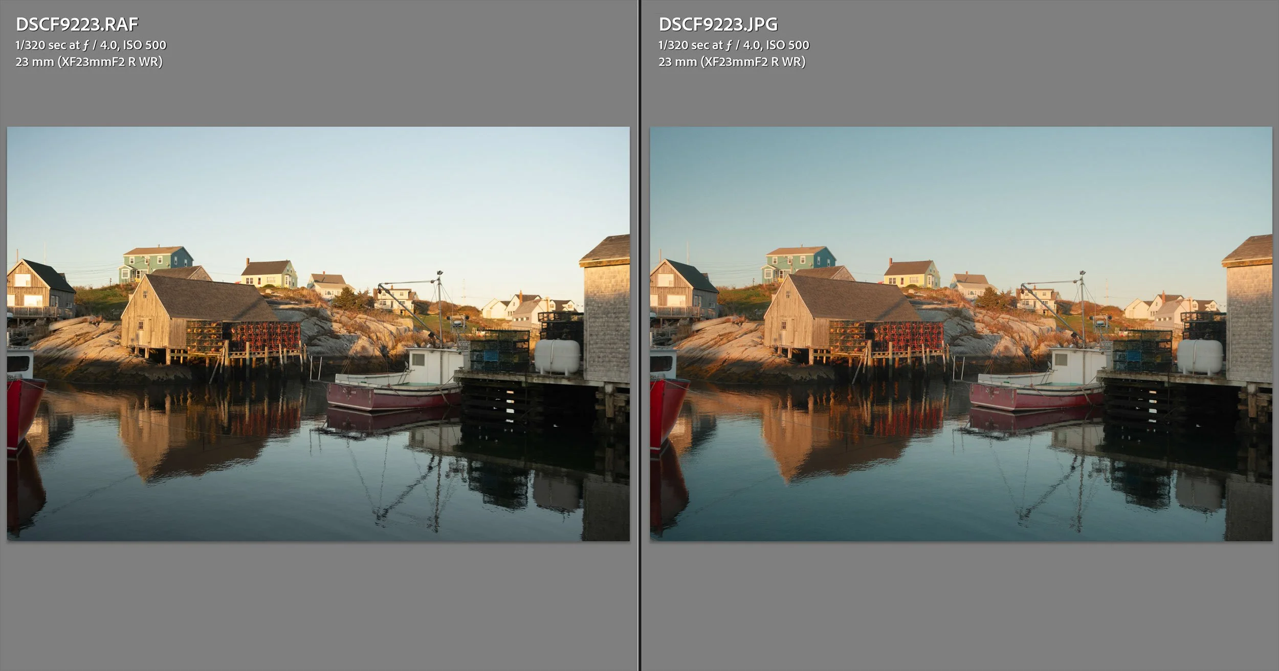
RAW (left) and JPEG (right) with Soft Vintage Glow Film Recipe
Looking at both images side by side gives you a better opportunity to identify what works and what doesn’t for you, and to adjust these settings in your recipe. This can be done easily with Lightroom's Compare View. I’d also recommend keeping a historical document with your recipe settings listed to track when and what changes you made. A simple document with dates and changes is easy to create and will help significantly if you have made numerous changes over a prolonged period. It can be challenging to revisit and identify which recipe was applied, and if you have made minor tweaks, it can be even more difficult.
One recipe will not work with all subjects or lighting conditions, and it’s essential to keep this in mind. Just because you didn’t like the results one day, doesn’t mean you won’t the next. Testing your recipe extensively is key. Don’t give up just because a day of shooting was not what you hoped for.
Conclusion
As you develop your experience with Fujifilm film simulations and recipes, you’ll realize that the process is as much about discovery as it is about creation. Each setting you adjust deepens your understanding of how colour, tone, and light interact to shape your personal style. The key is persistence. Experiment often, take detailed notes, and don’t be discouraged by mixed results. Over time, you’ll build not only recipes that echo your vision but also a refined sense of how to adapt them to a scene.