Ferraris of the 1960s: Two Pininfarina-Designed Classics

1963 Ferrari 250 GTE 2+2 Series III
It’s not very often I get the opportunity to photograph classic cars, and even more rare that I get an entire afternoon with two classic Ferraris. The automotive season for me was slim this year, with only a few photoshoots in 2025, and that’s fine. Even though the opportunities were minimal, I wasn’t pursuing automotive shoots myself. However, as I thought the shooting season was over, with most cars hibernating for the winter, an opportunity arose.
Two cars purchased a few years ago were being auctioned again, and I was commissioned to photograph both a 1963 Ferrari 250 GTE 2+2 Series III and a 1964 Ferrari 330 GT 2+2 Series I. Admittedly, I don’t have a thorough knowledge of classics, but I have a high appreciation for them. The design and manufacturing of cars have undergone profound transformations. Cars were built for power and style, and for Ferrari, their style is and still can be defined by Pininfarina, the design firm behind many of Ferrari’s most unforgettable and beautiful models.
What is Pininfarina?
Pininfarina refers to the Italian car design firm founded by Battista "Pinin" Farina in 1930. If you are a fan of Ferraris over the years, you are likely familiar with Pininfarina’s impact on Ferrari’s styling. The partnership between Ferrari and Pininfarina spanned over 60 years and ended with the Ferrari F12, which was in production from 2012 to 2017. With such a long relationship, it’s no surprise that Paninfarina has contributed to the reputation of Ferrari itself as a manufacturer of some of the most beautiful cars ever to exist.
Some of those models include the Ferrari F40, Testarossa, Dino, Daytona, and various other icons. Thanks to Pininfarina’s influence, Ferraris became known for both elegance and performance. The Ferrari-Pininfarina relationship was a significant period in automotive history, influencing automotive design and innovation.
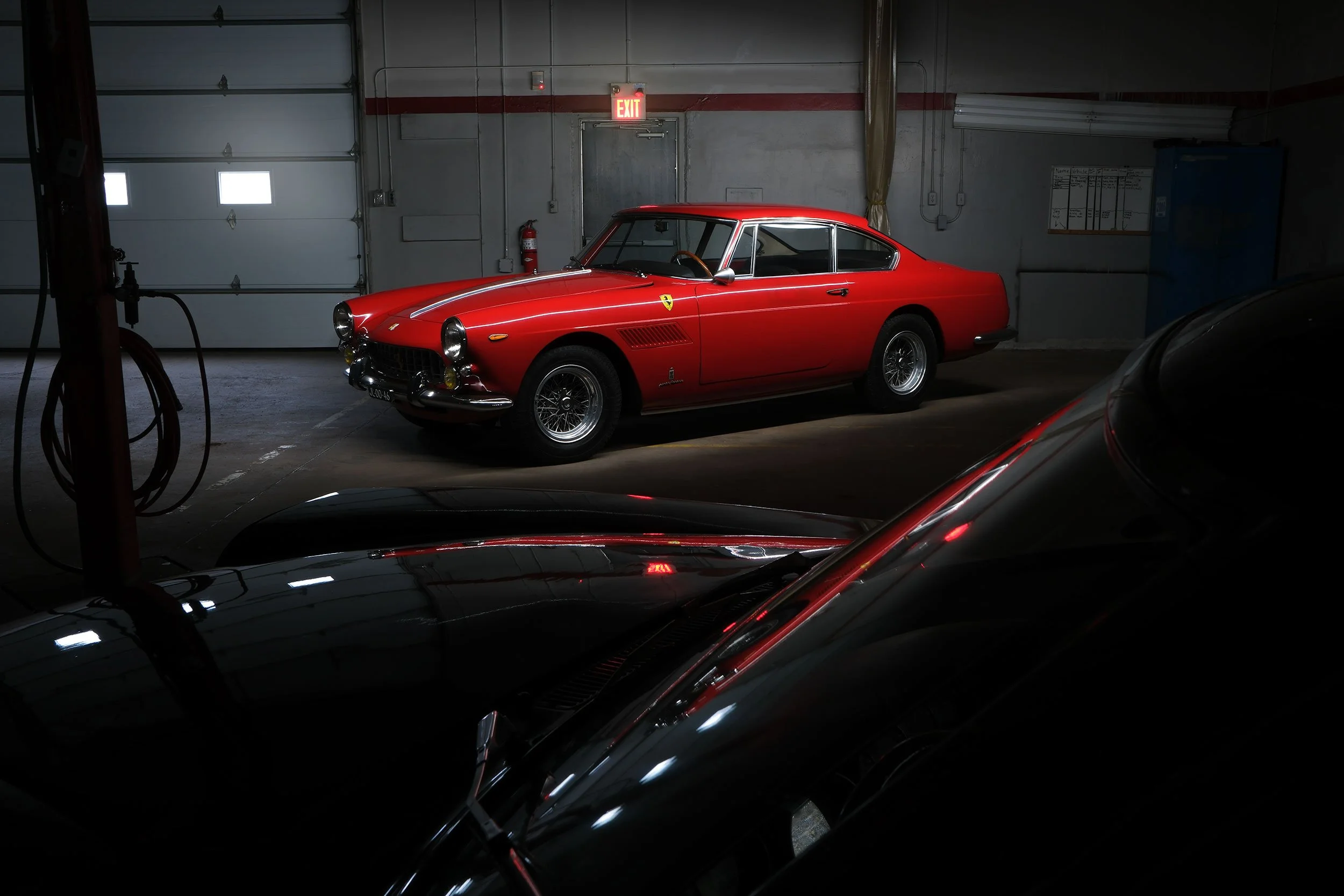
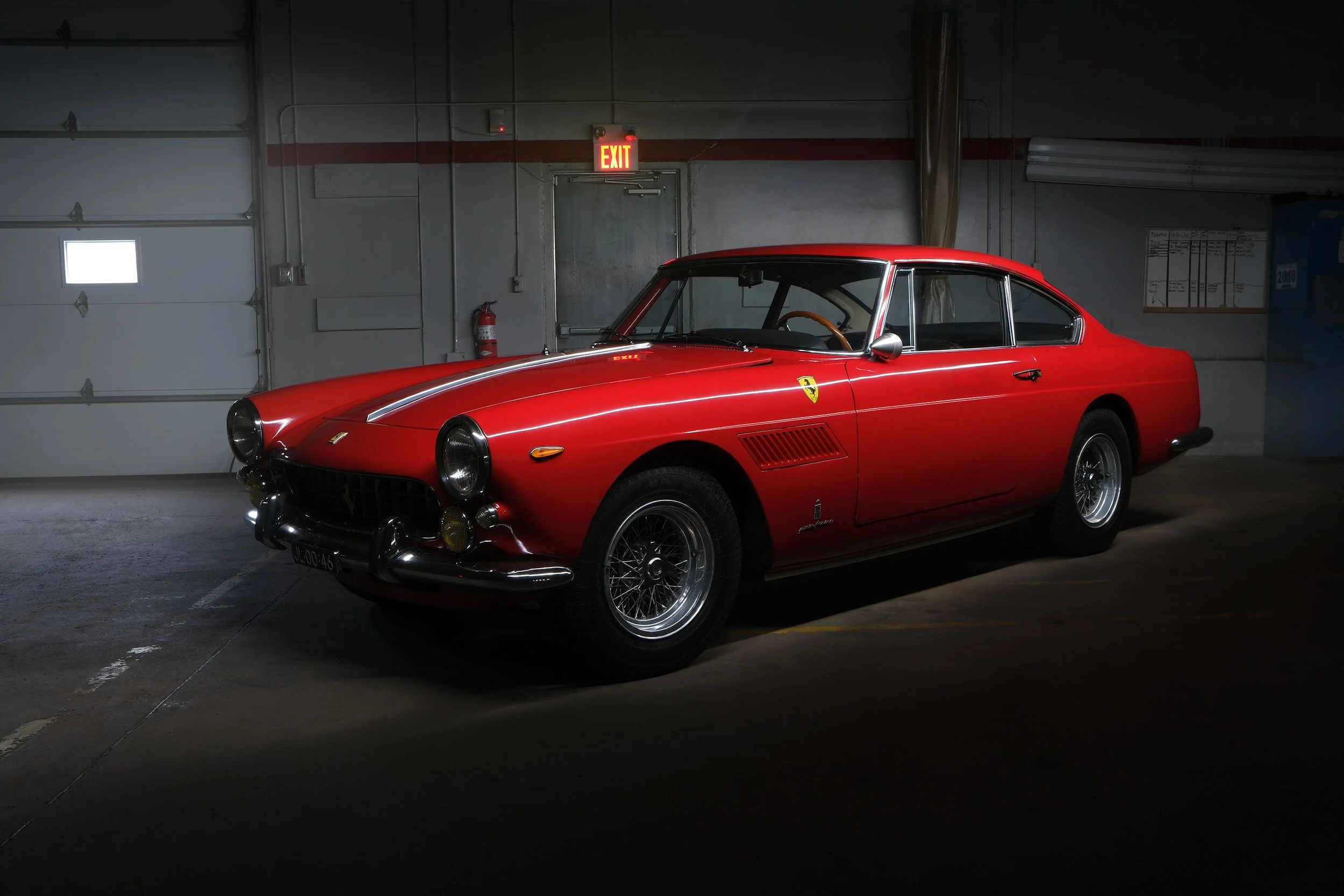
1963 Ferrari 250 GTE 2+2 Series III
The Ferrari 250 GTE 2+2 made its debut at the 1960 Paris Motor Show, marking a significant milestone in the company’s history. It was the first Ferrari designed explicitly as a four-seater. It features a 3.0-litre V-12 engine, capable of propelling the car over 240 km/h and accelerating from 0 to 100 km/h in under eight seconds, which was impressive at the time.
The third series of the 250 GTE introduced subtle visual updates and enhanced suspension with rear coil springs. This particular 250 was delivered new in Italy in April 1963. During part of its life, the car was with John Hugenholtz, a Dutch designer of race tracks and vehicles. He had this 250 restored in the Netherlands in the late 1970s and refinished it in its current red.
This 1963 Ferrari 250 GTE 2+2 Series III is offered with the original Ferrari chassis build sheet.
1964 Ferrari 330 GT 2+2 Series I
The 1964 Ferrari 330 GT 2+2 Series I was introduced at the 1964 Brussels Motor Show and features a 4.0-litre V-12 engine with 296 bhp. This Series I is apparently 1 of 503 manufactured between 1963 and 1965 before Ferrari moved on to the Series II. This grand tourer featured striking Pininfarina styling, with Ferrari sophistication.
This particular 330 GT 2+2 Series was first registered and driven in Paris in 1964. Originally, it was finished in Verde Scuro, a dark green colour associated with Ferrari. Today, as you can see, it has a striking blue shade, paired with its original beige interior, complete with a luggage shelf with straps in the back seats.
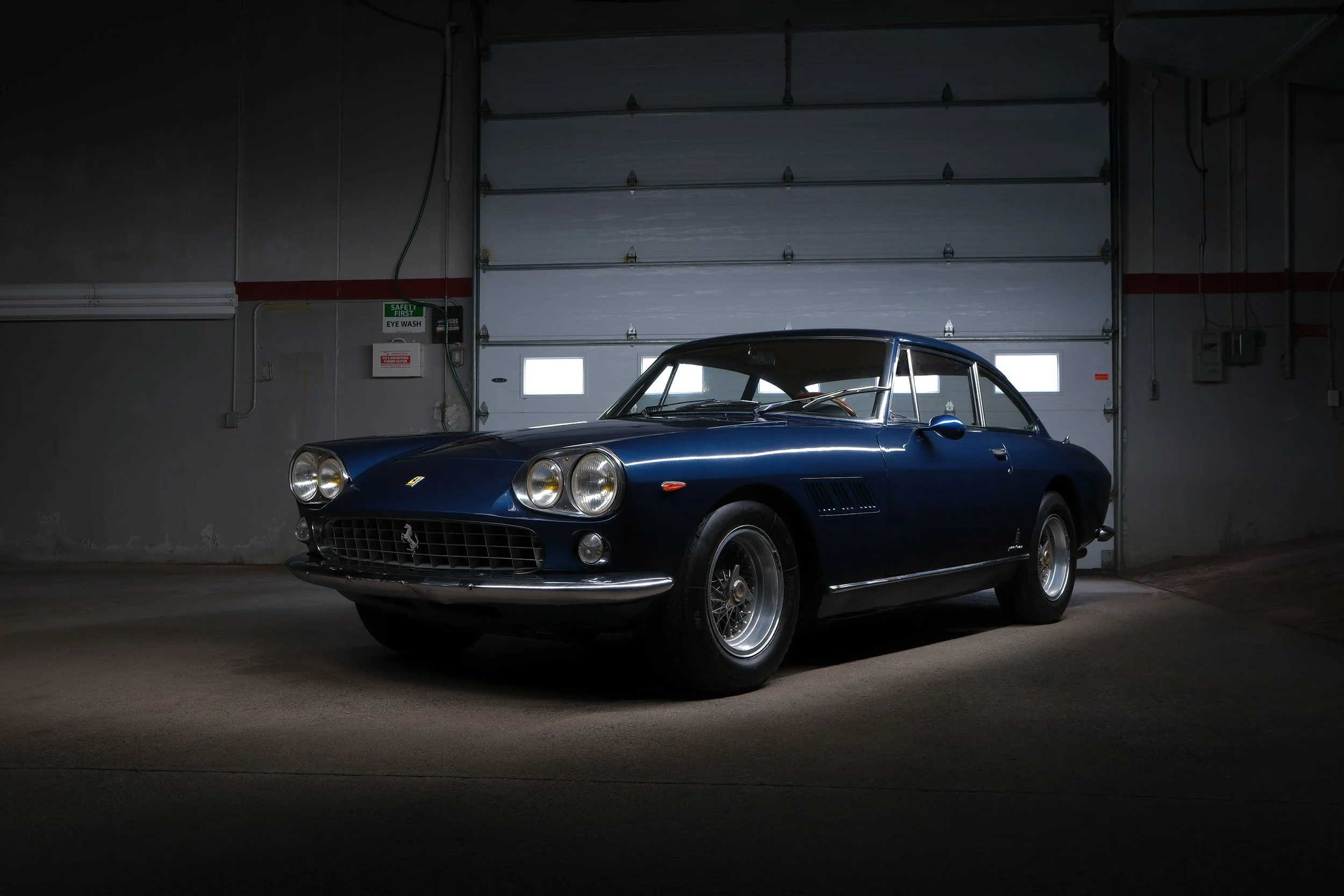
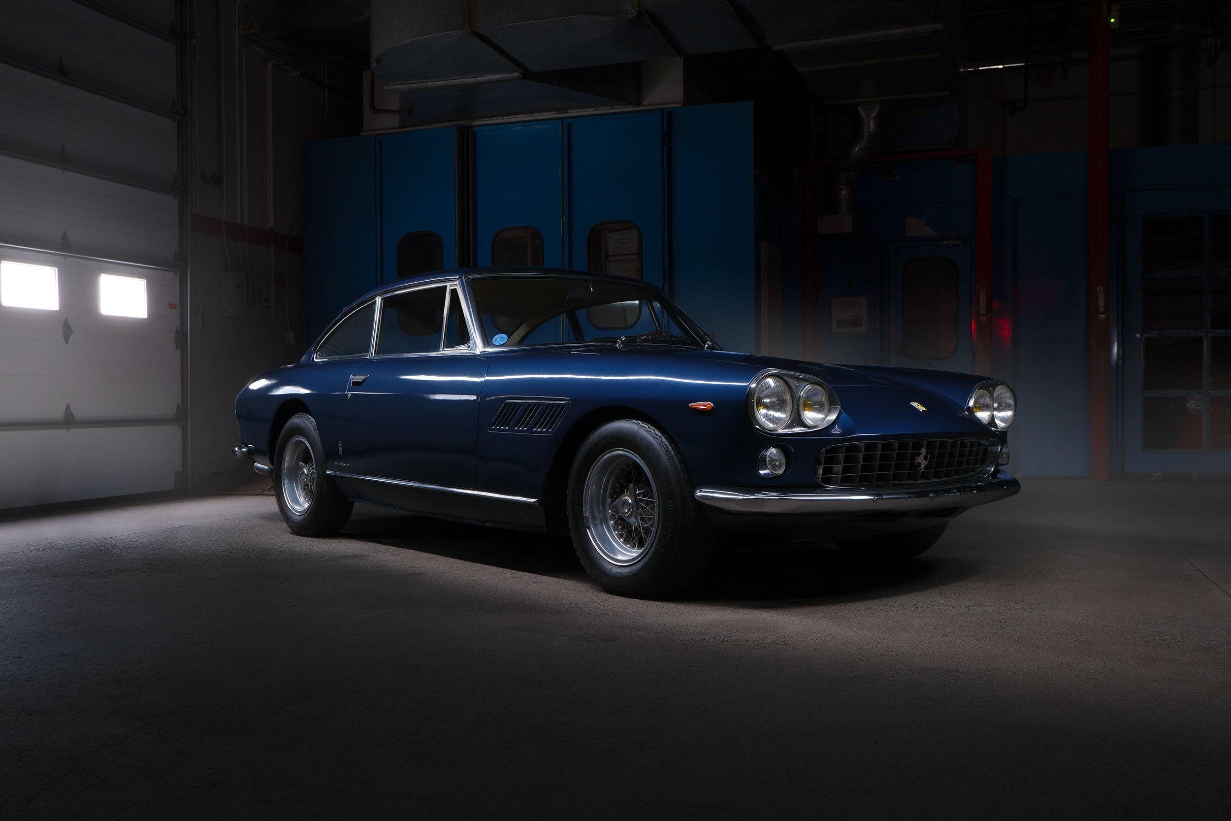
Photo Shoot Notes
The location was a disused car dealership, and this service bay was quite large. I think it seemed larger as there were no lifts and other equipment typical of a dealership service bay. As the dealership was no longer in use, the lighting situation was optimal. It was actually raining heavily on the day of the shoot, and the muted light from the bay doors complemented the photo shoot. Additionally, I have noticed that in some service bays, the lights are difficult to turn off and remain on, presumably for both safety and security reasons. Here, I could turn the lights off completely, which would really help with the light painting process.
Before I began light painting these two cars, I wanted to ensure that I captured all the necessary photos for them to be auctioned off. I opened a checklist on my laptop and ensured that I captured each angle and detail typical of auction listings. After I had captured what I needed, I took a few minutes to visualize the shots and get an idea of composition. Coming into this, I had hoped to capture both cars light-painted in one frame, but that didn’t prove easy, and I ultimately skipped trying to get both in one image. Both vehicles were well positioned individually, but a supporting post between them prevented them from being composed into a single frame. I didn’t have the option to move these cars around either.
Setting up, I used the Fujifilm X-H2 on a tripod. With the lights on, I composed and used autofocus to lock in focus. I then switched to manual to ensure it wouldn’t hunt for focus through additional exposures.
The Exposures
When constructing these images, I needed no more than three exposures to complete the final composition. When light painting to conceal details, the number of exposures required is usually lower.
Background Image
With the lights off, an exposure of about 25-30 seconds on a tripod using the 2-second timer to eliminate any vibration from pressing the shutter. I varied between f/8 and f/10, depending on how bright I wanted the background.
Car Light-Painting
With the lights off, I experimented with exposures ranging from 10 to 13 seconds long. I used the camera’s 10-second timer to give me time to get into position with my light. I started from the back of the car and held the light high above, walking towards the front of the car during the 10 to 13 seconds I needed.
Window Image (if needed)
Since I was holding the light up high, in some instances, the angle caused my Ice Light to be reflected in the side window. You can see that in the image below. Using a third exposure without that reflection, I blended it in using selections with the Pen Tool.
Lightroom and Photoshop
You may notice from the Lightroom previews below that I used a combination of JPEGs and RAW files. I started with the JPEG base, as the light-painted image required only minimal adjustments of a slight increase in vibrance. The background image was a RAW file because I needed to increase the exposure slightly, and RAW was the best format for that adjustment.
To combine the background with the light-painted car, I opened the images as layers from Lightroom to Photoshop and used a gradient mask to preserve the top portion of the background’s exposure, excluding the light streak while maintaining the car and the bottom half of the underlying layer. To create a precise outline around the car, I used the Pen Tool to create a selection around the car, and then saved the selection, as I would be recalling it later for other adjustments.
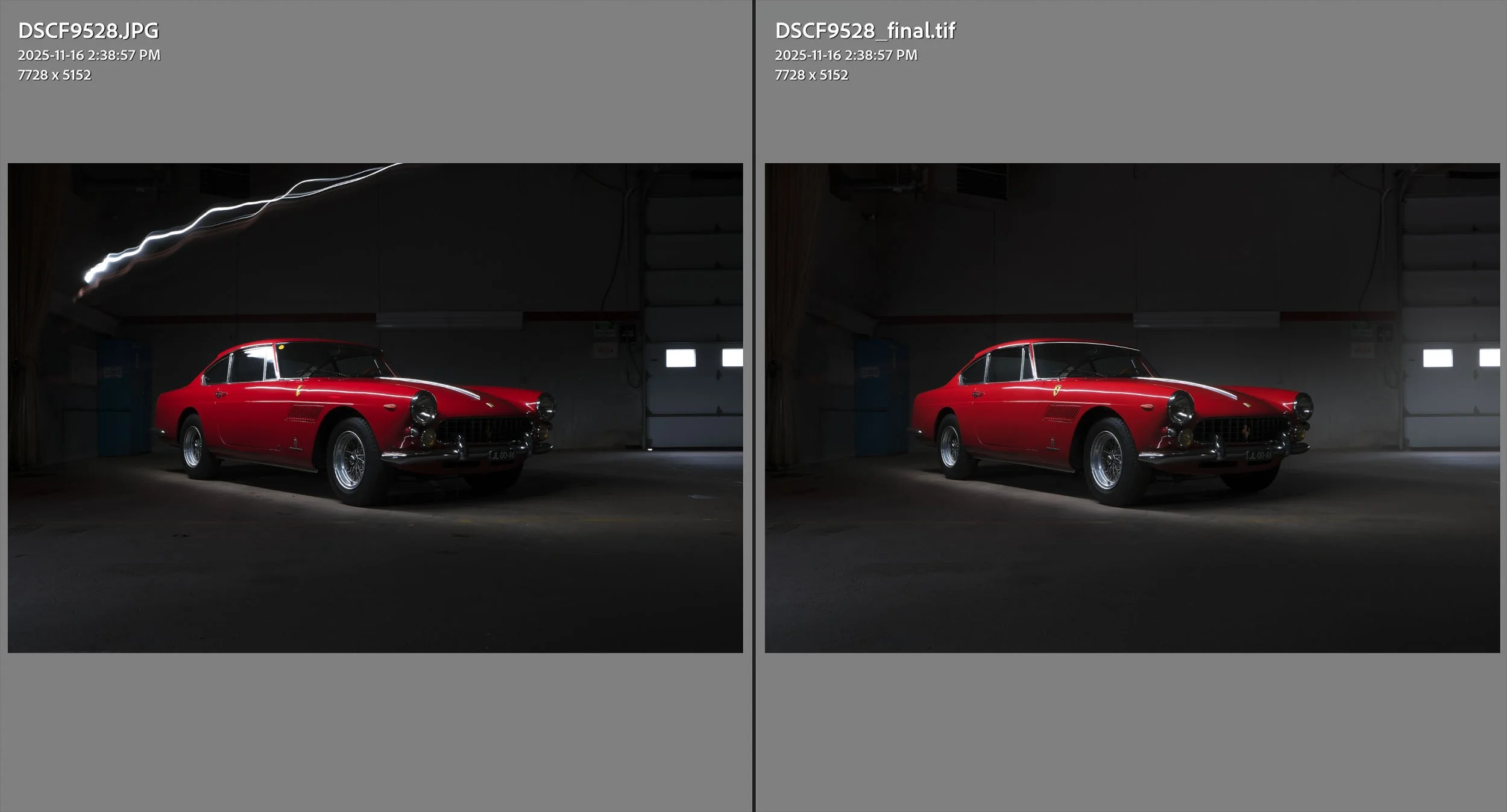
Capture vs. Final Image
Additional Editing Steps
I added a layer for cleanup. This is where I went over the background and foreground, cleaning up most of the larger elements, such as rocks, leaves, and general debris from a location like this. The cars themselves were very clean, and aside from a few spots, they didn’t require much cleaning up.
To create a bit of atmosphere, I used a white smoke brush to add a haze around the car, particularly around the windows on the bay doors, where it would be most noticeable. After using the brush, I applied a Gaussian Blur at a high setting to create a haze with soft edges and reduced definition. Then, recalling the car selection I made earlier, I could easily mask out the haze over the car, leaving it in the background. This subtle addition, I feel, is significant because it provides some separation between the car and the background, drawing more attention to the subject.
And finally, I added a Curves adjustment layer on top to slightly raise the blacks, eliminating the absolute black in the image, and a slight increase in the middle of the curve to brighten the whites and enhance the car’s brightness. These are both very subtle adjustments, but even the most minor one can make a massive difference in the final composition.
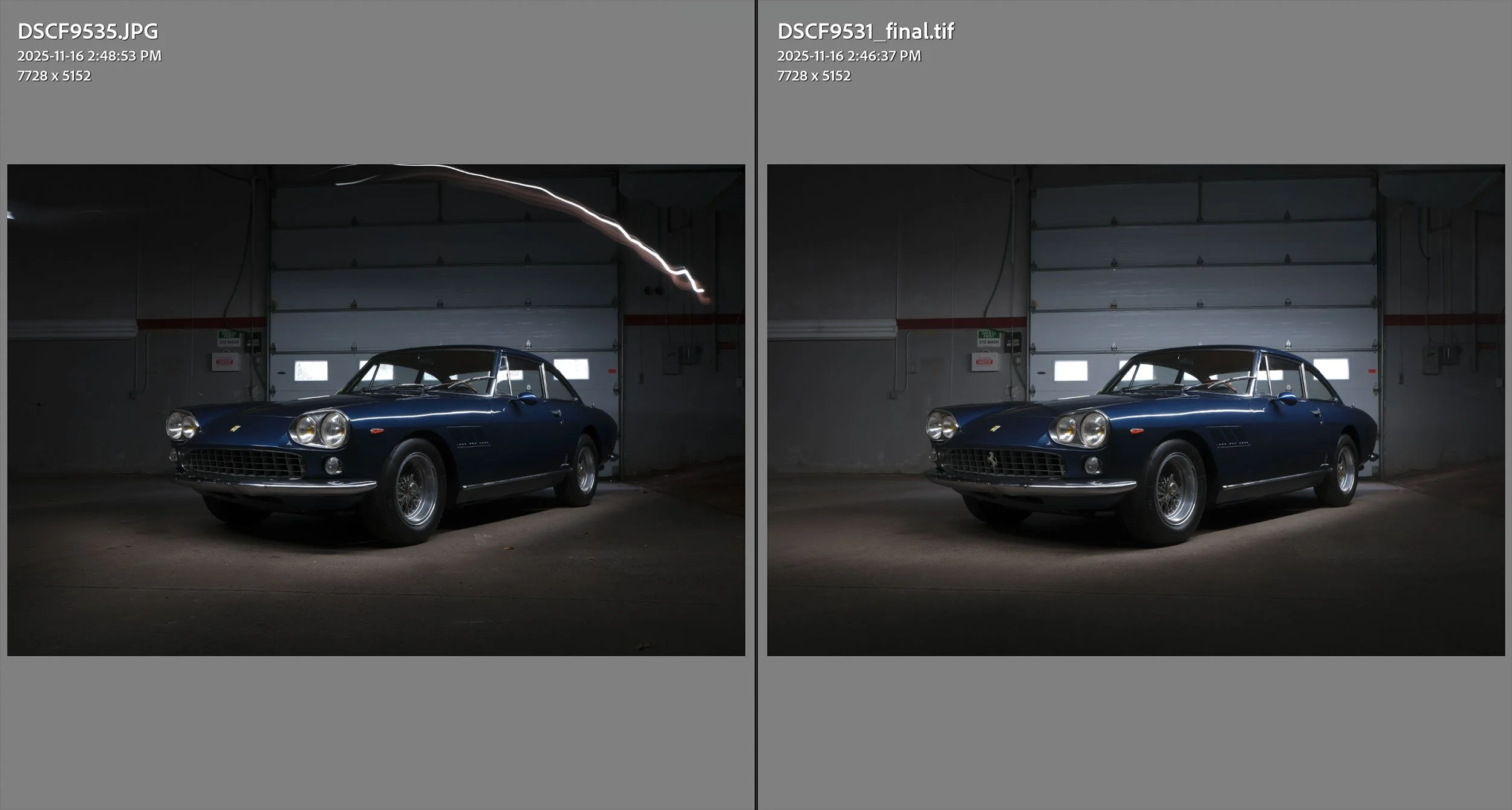
Capture vs Final Image
Final Thoughts
Photographing rare cars is exciting for me. I’ve always been fascinated with the history behind something. When I travel, I can’t help but think of the narrative behind the world’s landmarks. And with cars as classic as these, there is a continued appreciation for what they represented and the era in which they were made. How many people have driven these cars? What roads have they been on? What memories do they hold? Which owners did they mean something to? People can develop an emotional connection to cars, and I wonder how many people have loved these vehicles. That journey will continue as older Ferraris like these continue to gain value, and hopefully, many more people will be touched by their existence.