Peggy’s Cove with a New Fujifilm Recipe: Seaside Pastel
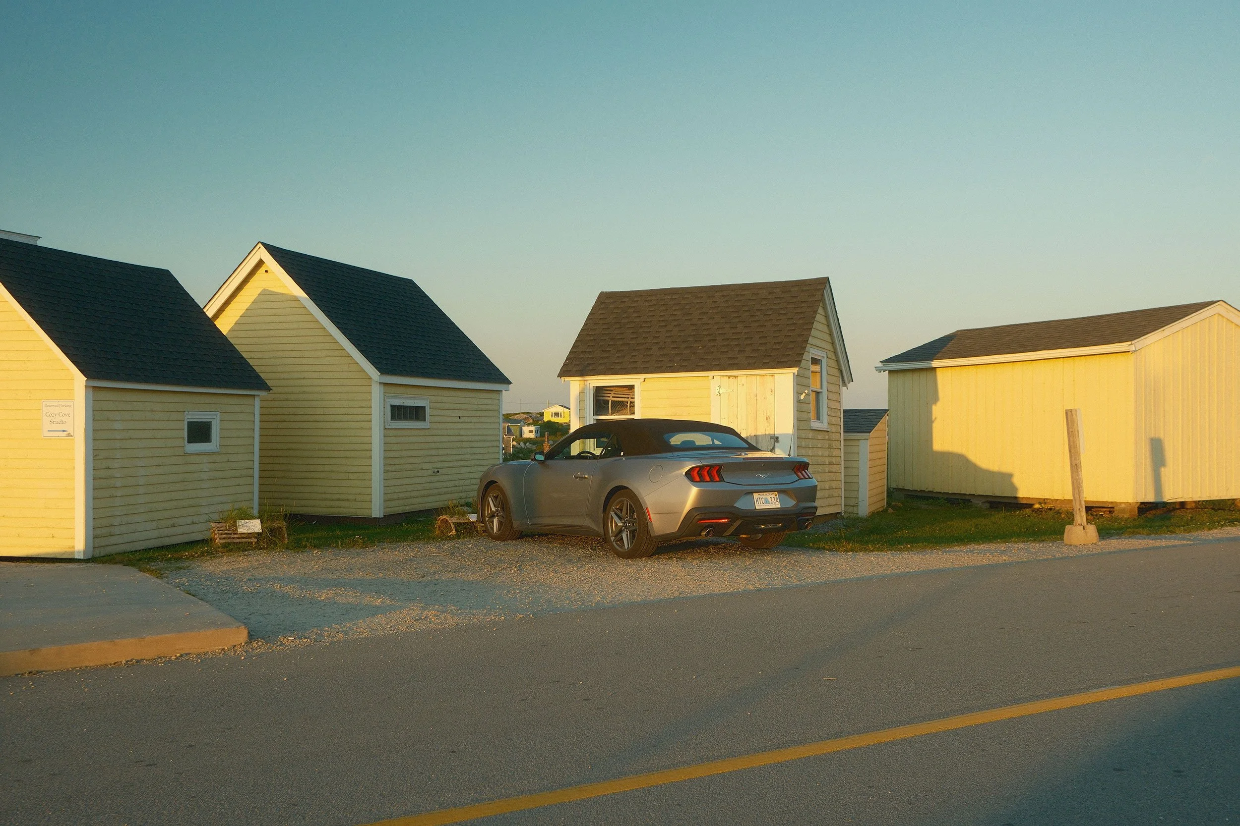
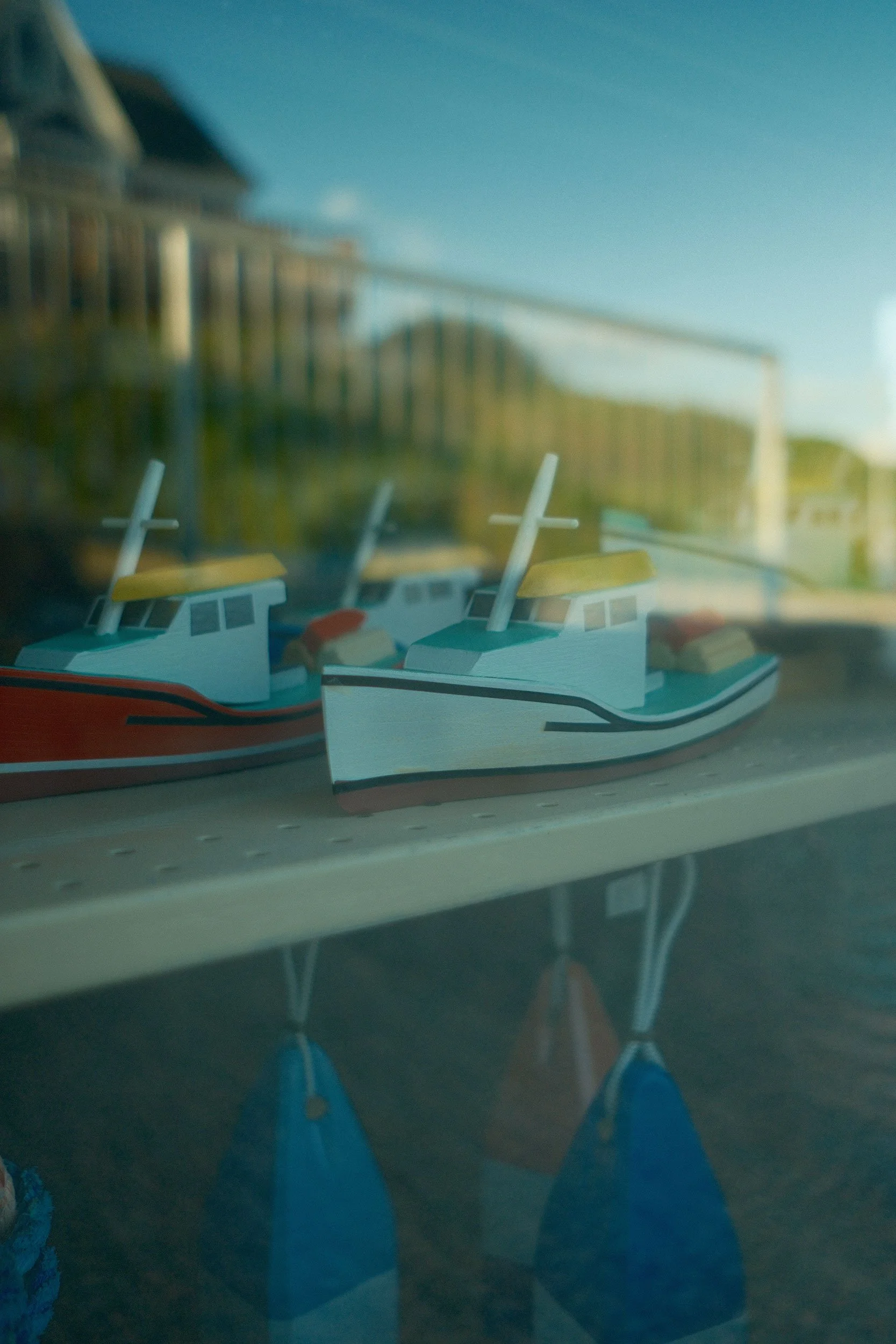
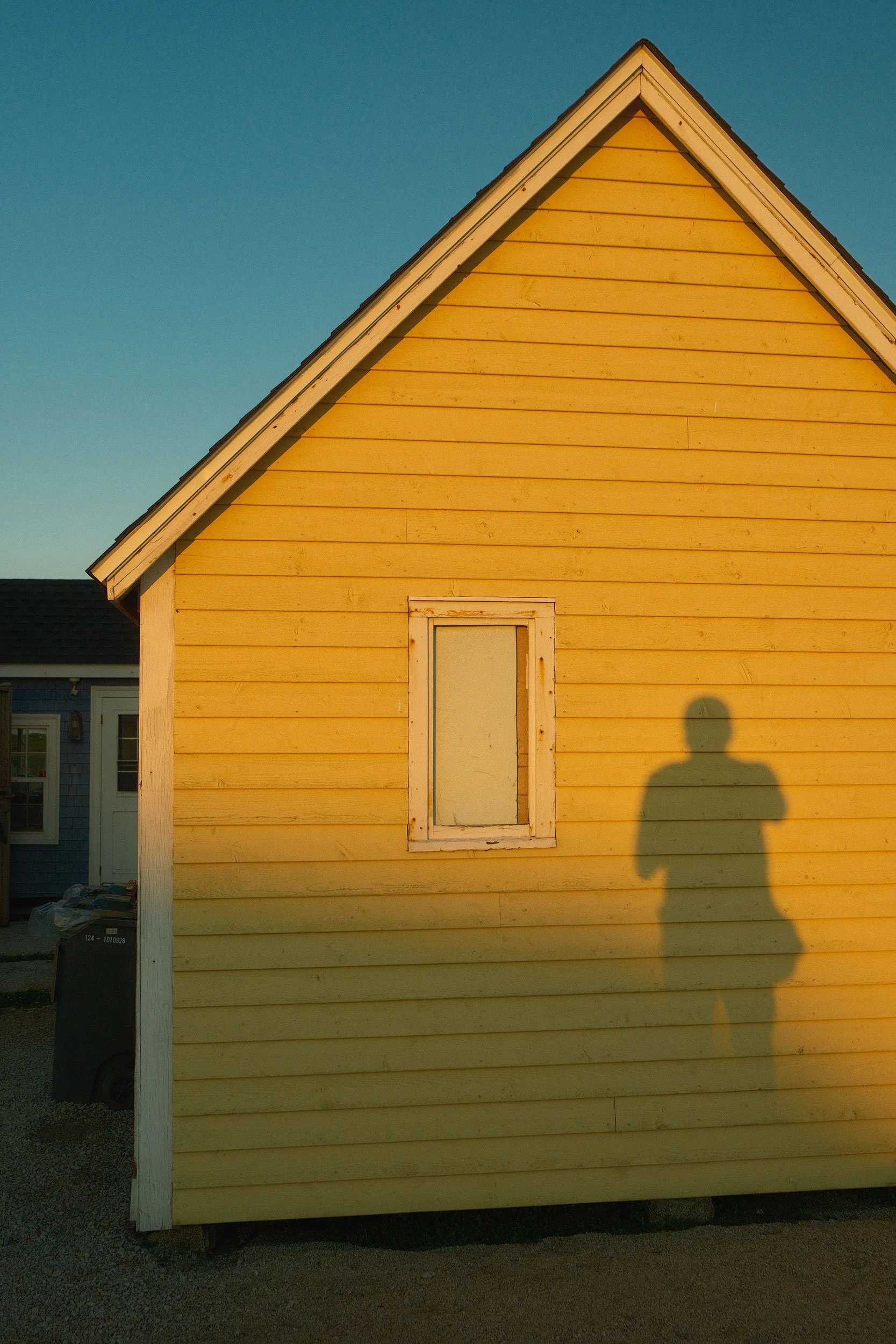
The quintessential summer mood: soft, warm tones, low contrast, and gentle shadows. That was the goal behind this recipe. Seaside Pastel is an airy, pastel look inspired by the feeling of a relaxed seaside vacation.
Film recipes are inherently experimental, since they depend as much on your subject and lighting as they do on the settings themselves. Some are more versatile than others, but the only way to know whether one suits your style is to test it in your own work. Even with plenty of examples online, it can be difficult to predict exactly how a recipe will translate to your photos.
This one is no exception. The images here reflect the kinds of scenes I enjoy photographing, so the recipe was designed with those conditions in mind. As with any film simulation, the results will vary depending on the light and subject matter.
So let’s take a closer look. I’ll discuss where it shines and where I don’t think it works quite as well.
Seaside Pastel Characteristics
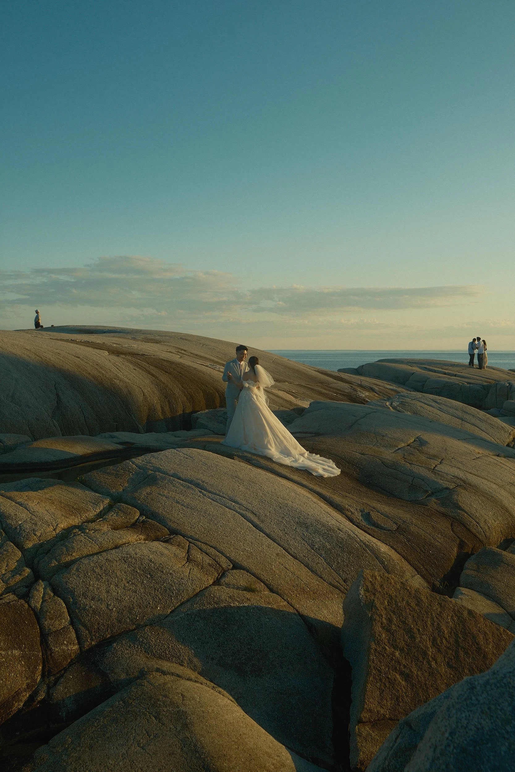
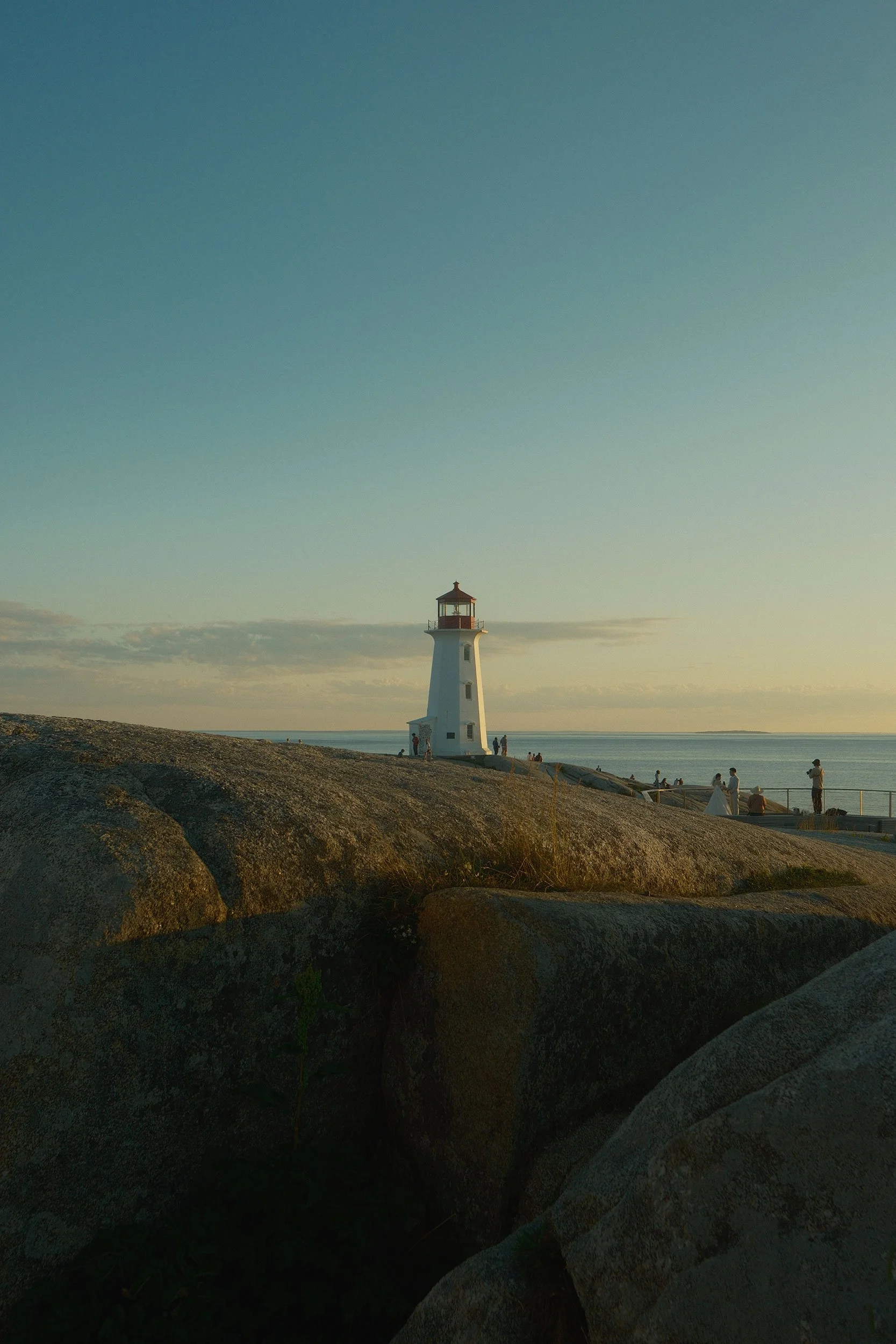
This recipe was created to capture the inviting beauty and quiet awe of sunlit coastal destinations. Inspired by peace and calm, it uses soft tones and colours that complement the sparkle of light on the water and the steady rhythm of the waves.
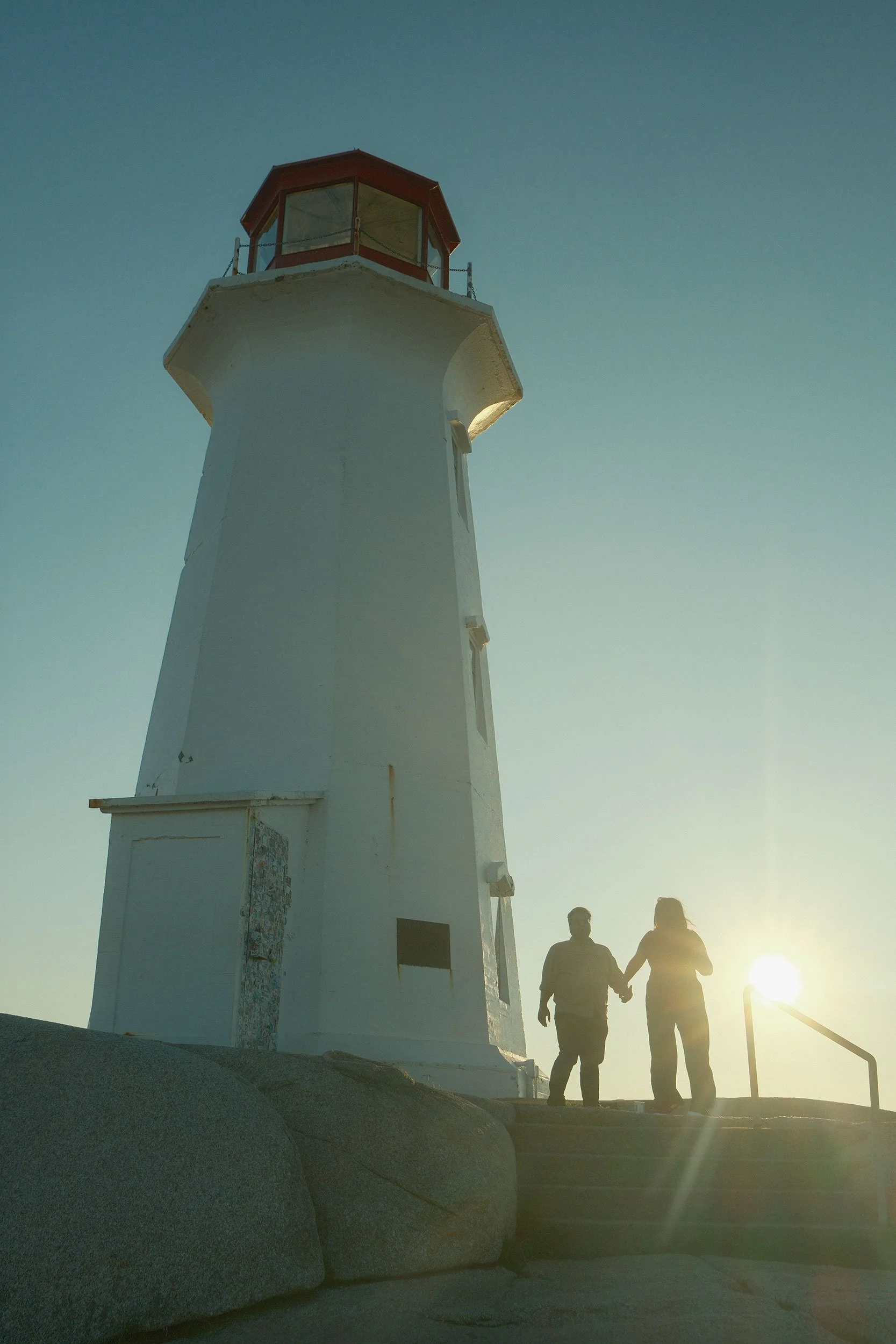
Living on Canada’s East Coast means I don’t have to travel far to find places where this recipe shines, such as Peggy’s Cove.
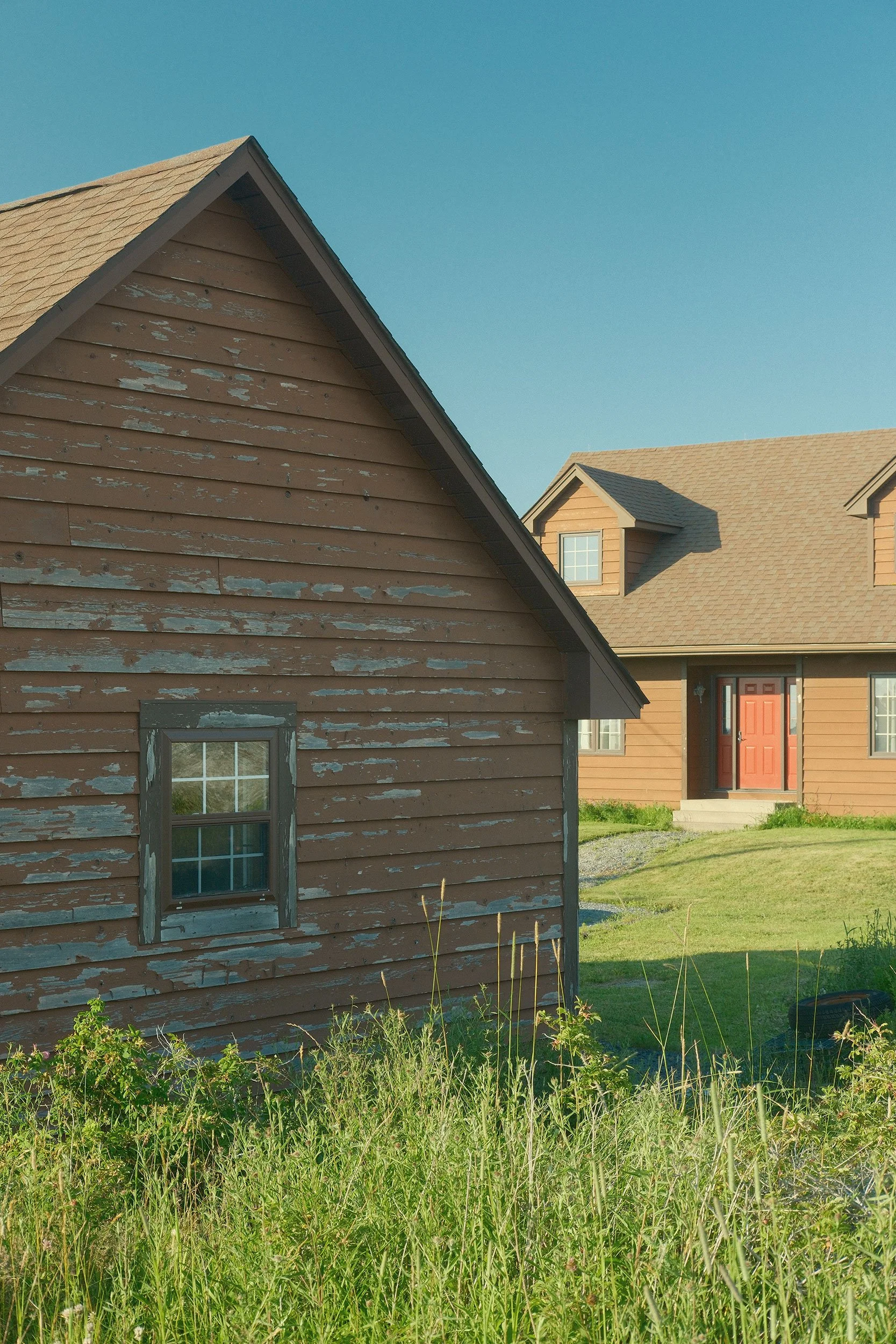
The recipe produces images with creamy highlights and rich but restrained blues, while still preserving a natural, true-to-life feel. Whites lean slightly warm, and greens are gently muted so the eye stays drawn to the light and colour of the scene. Contrast is softened, and shadows are lifted slightly to create a smoother transition from highlight to shadow while preserving detail.
Overall, it evokes a summer by the sea, when everything is quiet, and the only sound is nature all around you. As the day winds down, the scene settles into a sense of calm, openness, and quiet relaxation.
Where it Works Best
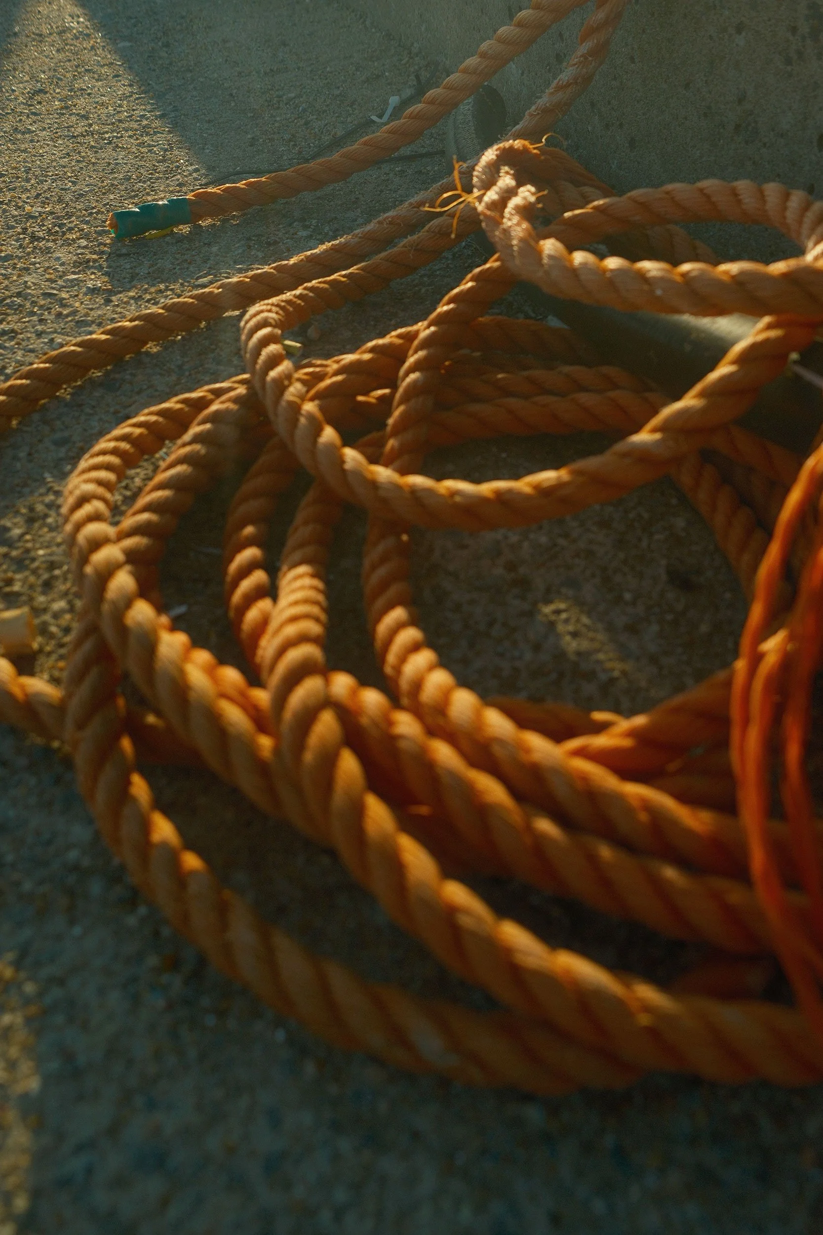
This recipe is ideal for travel photography, especially coastal landscapes and beach scenes where the shoreline becomes part of the composition. Although I haven’t visited Greece yet, I can imagine this recipe working beautifully there, where vivid blues and warm sunset tones would play off each other well.
At certain times of day, it can shift blues toward turquoise without making them look artificially saturated. At other moments, the blues become deeper and richer without feeling overly dramatic.
Light plays a major role in how any recipe performs, and this one really shines during golden hour. It is especially effective on summer evenings when sunlight is abundant and becomes a defining element in the scene. Overall, the look feels inviting, dreamy, and calming, with lifted shadows, reduced contrast, and a gentle warmth in the highlights.
Where it Doesn’t Work
Based on the recipe’s structure, I don’t think it would perform especially well in less-than-ideal lighting. Its pastel character depends on abundant sunlight to bring out colour, and overcast conditions are not ideal. In many cases, when colour feels muted, adding contrast can help, but this recipe keeps a more even contrast balance throughout, which can make images look flatter on cloudy days.
Although not limited to coastal scenes, as this recipe can work across a range of travel subjects, it isn’t the best choice if you want a strong separation between light and shadow. If your goal is to let shadows fall away into darkness while emphasizing highlights, this probably won’t be the right fit, since it tends to preserve detail in the darker areas.
What is the Recipe?
This recipe has two primary factors. First, it’s based on the Nostalgic Neg. simulation for soft colour and shadow tones. And the daylight white balance leans warm to balance the Colour Chrome Effect Blue.
Nostalgic Neg.
Dynamic Range: DR400
Highlights: -2
Shadow: -1
Colour: -1
High ISO NR: -4
Sharpness: -1
Clarity: -2
Grain Effect: Weak, Small
Colour Chrome Effect: Strong
Colour Chrome Effect Blue: Strong
White Balance: Daylight, -2 Red, -5 Blue
ISO: Auto (minimum of 500)
Conclusion
Like any film recipe, it won’t be for everyone, and it won’t work in every shooting condition or with every subject. But if you are looking to create travel-inspired images that lean into this soft, pastel look, this could work well for you. The resulting images from this recipe can come off as almost unintentional, simply a characteristic of the environment and the mood of the moment.
Seaside Pastel emphasizes colours but not in an overly dramatic way, leaving colour a character of the photo rather than the primary attribute.